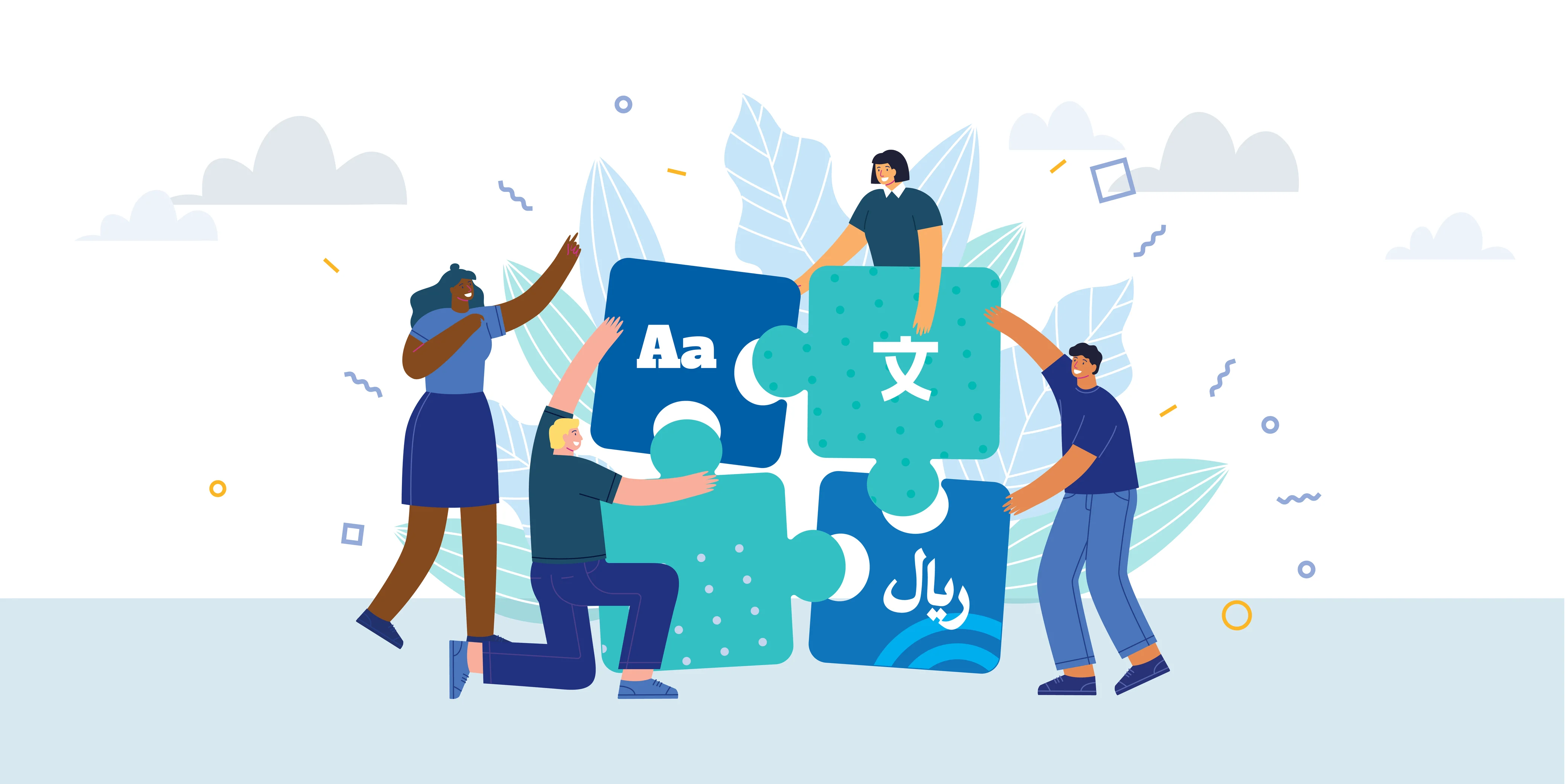
Designers today aren’t just crafting a visual — they’re crafting visuals that need to work across cultures, languages, and layouts.
But here’s the hard truth:
💥 A design that works perfectly in English can break instantly in Arabic, German, or Japanese.
Text overflows. Fonts fail. Layouts collapse.
And suddenly your clean, on-brand creative turns into a mess of misaligned boxes and mistranslated banners.
So how do modern design teams keep their visuals sharp, scalable, and culturally relevant?
Welcome to visual localization design thinking — and why it matters more than ever.
🎯 Why Visual Localization Is a Design Challenge
Designers are used to adapting creative across formats (social, display, email). But adapting for language adds new friction:
- 🌐 Different character sets (e.g. Latin, Cyrillic, Kanji)
- 📏 Text expansion (English → German = often 30% longer)
- 🔤 Font compatibility issues (some languages require full replacements)
- 📐 Layout shifts (right-to-left vs. left-to-right)
And yet, visuals still need to:
- Follow brand guidelines
- Stay visually balanced
- Deliver clear messaging instantly
That’s not just localization. That’s multilingual design engineering.
💡 Design Best Practices for Localized Visuals
If you're building visuals with global scale in mind, here's what to keep in your design toolkit:
1. Start with Flexible Layouts
Avoid locking your text in tight boxes. Assume translations will need more space.
Use padding, margin, and dynamic containers that can stretch without breaking harmony.
2. Choose Multilingual-Friendly Fonts
Stick to font families that support broad character sets — think Noto Sans, IBM Plex, or Inter.
If your brand font doesn’t support certain scripts, define a fallback pairing in your style guide.
3. Design with Text Replacement in Mind
Keep embedded text (like headlines inside an image) layered and easy to swap out.
Better yet: use tools like Loxalize AI that can auto-detect, translate, and replace text directly in exported images.
4. Respect Cultural Nuance
Colors, icons, and imagery have cultural weight.
What feels friendly in one market may feel awkward (or even offensive) in another.
🧠 Example: A thumbs-up icon works in the U.S., but not in parts of the Middle East.
5. Build for RTL (Right-to-Left) Languages
Arabic, Hebrew, and Urdu read right-to-left — which can flip your entire layout logic.
Plan for mirrored versions or create design systems that can adapt directionally.
⚙️ How Loxalize AI Helps Designers Scale Without Compromise
Designers aren’t supposed to spend hours:
- Manually swapping translated text in Figma
- Re-checking alignment for 10 languages
- Recreating banner ads from scratch
Loxalize AI automates this for you:
- 🧠 Detects text inside your image
- 🌐 Translates it into any language
- 🎨 Reconstructs the image — same font, same layout, same brand style
🚀 Real-World Use Case: Creative Teams Going Global
Let’s say your agency is designing a product ad for an upcoming global campaign.
You’ve got:
- Hero visuals with overlaid messaging
- Language-specific CTAs
- A timeline of five language rollouts
Instead of building five design files manually, you create one master visual — and Loxalize AI handles the rest.
🎯 End result:
- Consistent creative
- Faster launch timelines
- Happy designers not drowning in repetitive edits
📐 Final Takeaway: Great Design Translates — Literally
Designing for a global audience used to mean sacrificing control for scalability.
Now, you can have both.
With the right tools and practices, designers can:
- Maintain visual quality
- Scale campaigns across cultures
- Preserve brand integrity
- And still focus on creative thinking — not grunt work
✍️ Ready to Make Your Designs Global-Ready?
With Loxalize AI, creative teams can:
- Translate and localize visuals in minutes
- Keep fonts, layout, and quality intact
- Empower design without slowing it down
👉 Try Loxalize AI Free – Localize Beautifully
.png)